Wednesday, December 23, 2009

Grumpy Old Turtle (Part 1)

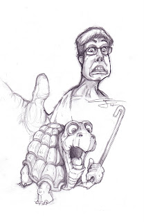
Going through my old sketches I found this one:


I really like the turtle so I thought I'd finish it up. I'm going to post the steps I take in a bit more detail than the last so you can get a better idea of how I work. first step is to take the image into flash:


I then turn the image into a symbol... call it template and reduce it's opacity to about 50 percent. I then change the background to a color other than white... this just helps me see what i'm doing a bit better. I also like to move my timeline placement to the left as I'm only going to be working on multiple layers on the first frame. I also "guide" the template layer so I can publish the image without the sketch. Using the Square and Oval tools I'll create solid color shapes and then push and pull them using the pointer tool to get the shapes to my liking. Here's it a bit of the way through:


Here's a tip: for shading, after you have gotten your shape where you want it, select that shape and cut it into areas using the line tool. then select the areas you want to shade and darken or lighten them accordingly... then delete the lines.


Another tip: for thin shapes sometimes it's best to create them as lines and then turn those lines into shapes and then you can shape them to your liking:


Okie Dokie... here's the result so far... still need to do more shading and details and then I'll bring into Photoshop for the second part.

Hope you all have a great holiday!
-Chris

Tuesday, December 15, 2009

Super Mario Brothers (Process)

So I thought for the first week I'd post some of the projects I've already finished and talk just a little bit about the process. This first one is an illustration of everybody's favorite plumber brothers... Mario and Luigi. It came from this sketch I drew back in 07 that I found I had scanned into my computer.

 Since I've made the decision to finish off any project I start now (that's been a huge problem in the past), I decided to see what I could make out of it. The second step after scanning a drawing in or creating it in the computer with Sketchbook Pro (highly recommended program) is to bring it into Flash. You wouldn't think flash would be the program of choice for Illustration, would you? I find that I work faster in Flash over Illustrator and like the way can "organically" push and pull on lines and edges of shapes with the pointer tool rather than mess with anchor points and such in Adobe Illustrator. If I need precise curves, I'd use Illustrator, but for this Flash is quicker and more than adequate. I'll post some screenshots in another post as a sort of tutorial soon.

Anyway I came up with this


looking more like the dynamic duo, but not very interesting. Well I hate to skip a few steps and will try not to in the future, but after creating these flat solid color versions I export the image(s) out as a transparent png and bring it into photoshop. There I like to add shading, texture, scenery, and mess about with the colors. Taking actual photography and blending it into the scene to give it just a tiny bit more pop.
here:


You'll notice that the grass is from a real photograph, the dirt, and the pipe as well. That's not all. It may be hard to see, but I also often like to add texture wherever I can.. whether it's immediately noticeable or not. The hats and shirts have cotton textures on them... subtle but they are there. The boots have leather texture, and even the skin... if you were to zoom in you'd see faint pores from a skin texture I put on them.

It's not the best illustration in the sense that there is no real concept behind it. But I like how it turned out. I probably could have added way more from the mario world. Yoshi perhaps?

Anyway I'll go into better detail in following posts. This was just a basic rundown to give you some background on my process and to get me used to posting. I'll try and be a little less wordy next time. My first follower knows I can ramble on and on sometimes ;)


Monday, December 14, 2009

Welcome to Chris Fuller's All new Illustration and Animation Blog!

Hi all,
So after a couple of false starts I've decided to really buckle down and create this blog. Here I will post sketches, illustrations, animation snippets and anything else I'm working on. I'll be giving tips on my workflow process, links to any great tutorials I find online, and more.

I'd love user feedback, thoughts, tips, criticisms, and the like as I'd like this to be a place where I can share the little knowledge I have gained as well as gain some knowledge from you as well.

Here's a little background for you all. I graduated from college with a degree in interactive multimedia design and communications... a mouthful I know, but it really means I went to a school that taught you how to use the Adobe suites tools... and not much else. I've been teaching myself animation for the past couple of years although until now not very seriously. So all you professional animators and illustrators think of this blog as a place to come to teach... you know they say the best way to learn.... :)

I work as a Flash Animator and freelance on the side... sometimes Flash work, sometimes Illustration. I want to get into Children's book illustration and writing as well as Character Design for Cartoons.

Also I've recently taken on the name "Kookaburrito Studios" for my business... a combination of a Kookaburra (a bird) and a burrito... I love nonsensical as you will soon realize. I'm converting over from my boring "Fuller Design" business name so if you see that logo that's why.

Anywho... I'll be posting about 1 to 2 times a week. I'm pretty busy so I can't promise more than that although I'll try.

For this first post let show you some roughs of the new logo! Would love your feedback... and yes I know Kookaburras are not pink... but I like the color scheme.

What d'ya think?